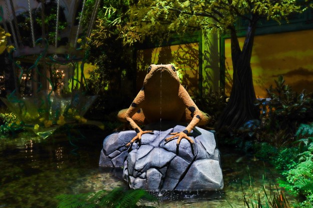
Contrasting Colors (Limited)
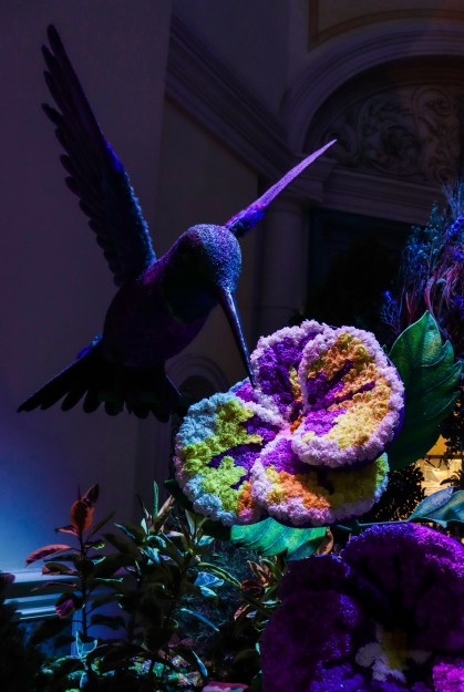
More Contrasting Colors (Vibrant)
With most colorful photos it’s nice to have a theme, but having contrasting color pieces really makes a photo pop. For the first photo, I had a theme with yellows and greens, but the contrasting piece is a frog sitting on a rock that is almost a pastel greyish-blue. The second one had a range of contrasting colors, with the flower being the most contrasting piece to the blue and purple scheme.
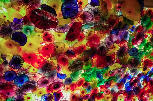
Vibrant And Colorful
Sometimes it’s good to have a scheme, but sometimes it’s more fun to just fill a photo with as much color as possible. A lot of HDR photos do this. But try to make sure there isn’t too much going on- we want to grab the attention of the viewer with an explosion of color, but we don’t want to give them a headache.
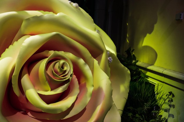
Limited Color Pallette
Limited Color Pallettes in photos can be a bit difficult. You have to make sure colors are not too heavily weighted on one side or another, and that the colors themselves contrast well. Shades of the same color fall into the same category. In this photo, my main colors are yellow, red, and a touch of green.
